What to look for when someone is trying to lie with data visualizations
We live in an age of Big: Big Computers, Big Data, and Big Lies.
Faced with an unprecedented torrent of information, data scientists have turned to the visual arts to make sense of big data. The result of this unlikely marriage — often called “data visualizations” or “infographics” — have repeatedly provided us with new and insightful perspectives on the world around us.
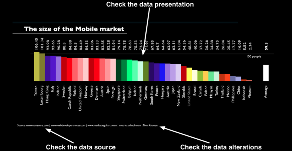
However, time and time again we have seen that data visualizations can easily be manipulated to lie. By misrepresenting, altering, or faking the data they visualize, data scientists can twist public opinion to their benefit and even profit at our expense.
Source: 3 easy steps to avoid deceitful data visualizations | Dr. Randal S. Olson
With the rise of fake news and exaggerations, being able to identify when visualizations are lying or being deceitful is a very important skill.