The Surprising History of the Infographic | History | Smithsonian
We live in an age of data visualization. Go to any news website and you’ll see graphics charting support for the presidential candidates; open your iPhone and the Health app will generate personalized graphs showing how active you’ve been this week, month or year. Sites publish charts showing how the climate is changing, how schools are segregating, how much housework mothers do versus fathers. And newspapers are increasingly finding that readers love “dataviz”: In 2013, the New York Times’ most-read story for the entire year was a visualization of regional accents across the United States. It makes sense. We live in an age of Big Data. If we’re going to understand our complex world, one powerful way is to graph it.
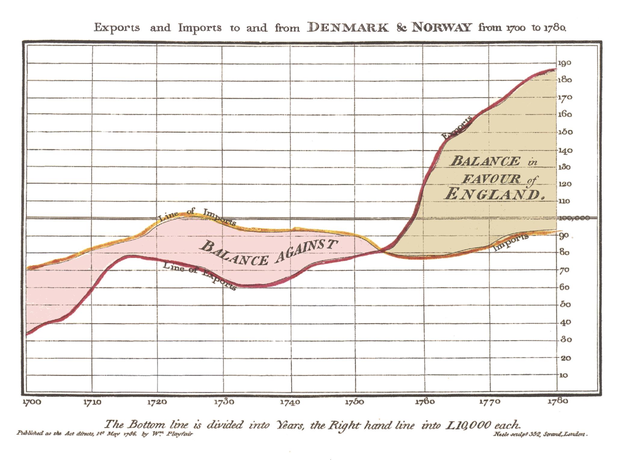
But this isn’t the first time we’ve discovered the pleasures of making information into pictures. Over a hundred years ago, scientists and thinkers found themselves drowning in their own flood of data—and to help understand it, they invented the very idea of infographics.
Source: The Surprising History of the Infographic | History | Smithsonian
Awesome history about visualizing data, the history of data, and why we use infographics.


