Select proper fonts for usernames, passwords, and urls.
How many times have you been given a username and password, and have to go back and ask “is this a 1 or an l” or “is this a 0 or an O”? Selecting a proper font for usernames, passwords, urls, commands, etc. can save you time and make the experience less frustrating for your students. Here are some tips on picking a font:
- The font should be monospaced. A lot of fonts are proportional, which means a **i** takes up less space than a **w**. When looking at the font, check that all of the characters are the same width.
- Check that 1 (one), I (capital i), and l (lowercase L) all look different.
- Check that 0 (zero) has a slash or dot through it to make it look different than O (capital o)
Two good fonts to use in Google Docs are Consolas and Courier New.
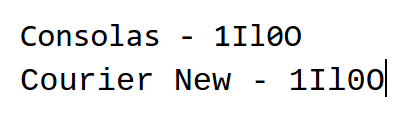
As you can see, each of the troublesome characters have a distinct look and will be less likely to be typed incorrectly.


One Comment
Comments are closed.